One of the most important skills to master in the world of design is working with copy and typography. Text is a primary way that designers communicate to their users and viewers, and the right typography can instantaneously set your branding project apart. Below, we’ll be looking at some helpful rules for typography that any designer can use for any project.
5 Typography Rules
01. Set a Typeface Limit
As designers, we’re visual communicators—and when it comes to communication, a lack of clutter is key. This is why limiting your typefaces within a project is such a vital process. Working with more than 3 typefaces in one design can lead to confusion and an aesthetic that is not cohesive, creating an unpolished feel in the overall design. If we limit our design typefaces to two or three pairing fonts, that’s an immediate way to give our layout some structure and control.
02. Limit Line Length
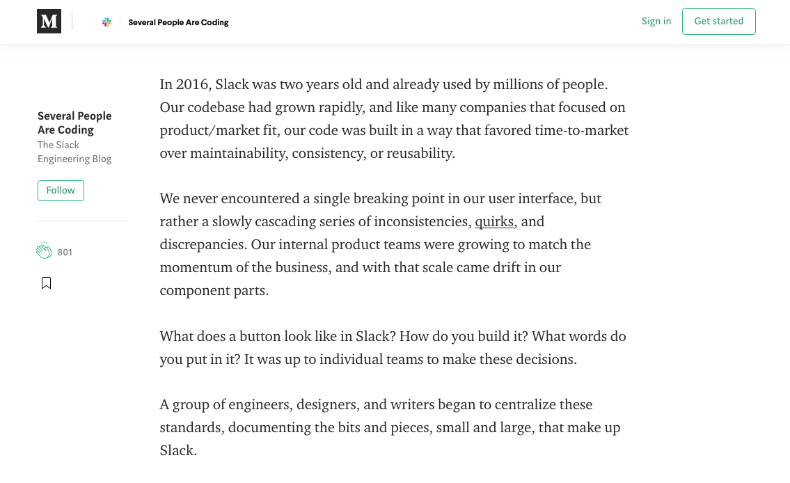
As a general rule, limiting the line length of your body copy is a good practice to increase the readability of your design—especially for digital copy such as websites or apps. As a good practice, small portions of copy should be limited to 40 characters per line, whereas longer content (like blog posts) has a target of 60 characters. This makes it easier for the user to be able to read long or short copy in a small amount of time while it being easy on the eye.

03. Use Size Contrast
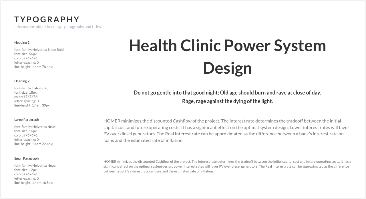
Another way to strengthen your typographic layout is by establishing contrast between font sizes. By using the design principle of proximity or grouping, you can group your copy by weight to create a cohesive feel. Additionally, you could experiment with skipping weight within the typeface between your headings, subheadings, and body copy. If you’re feeling stuck, it’s a good time to play around with the kerning and tracking of your headings and subheadings within the layout to see what works best for your specific project.

04. Build a Typescale
Before even laying out your copy, it’s often beneficial to lay out a type scale that you can adhere to during the duration of the design process. Having a set scale for how big or small your different type components will be can establish a good hierarchy right off the bat, reducing the need for trial and error later on. During this process, it is helpful to use a font that scales well on desktop and mobile—but even if you’re working with a print project, this can still be useful for legibility.
Check out this in-depth guide on “Defining a Module Type Scale.“
05. Utilize Whitespace
Whitespace is a highly effective design element, but it can be frightening to make room for it in your project. Whitespace is useful for balancing typography within the layout of the design and can efficiently create contrast in the hierarchy. Adjusting the line height of your copy and leaving ample space between headings and body copy can give everything room to breathe and result in a cleaner, sharper look overall.
If you’re looking for the right website design, you’re in the right place. Contact us today to get started.


