
When it comes to adding design elements to your business, everything you produce can be a canvas for expressing creativity. Whether it be a logo, t-shirt, your website, or your overall brand strategy, every visual medium can communicate a bit about your business in a unique way—and craft beer label design is no different.
If you sell a physical product, your packaging is an extremely important vessel for getting your brand’s message across—and in the competitive craft beer market, nailing your marketing is vital to success. To give you some inspiration, we took a look at several craft beer labels that are sure to catch customers’ eyes on the shelf.
4 Craft Beer Label Designs We Love
Cerberus IPA 3
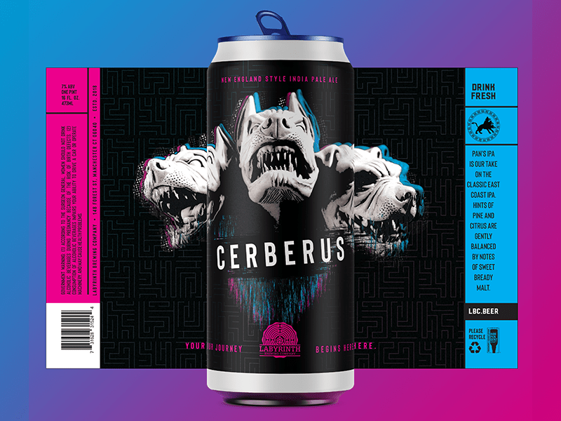
This label by Raboin Design Co. was designed to showcase what makes Labyrinth Brewing’s Cerberus IPA 3 special. The label is a fun play on the name of the IPA, and if you put three cans side by side, the full print emerges for a stunning shelf display. To take it a step further, the dogs are outlined by a glitch effect to elevate the illustration above traditional black and white, creating a subtle pop of color that’s carried throughout the design.
Rinse/Repeat Galaxy Brut
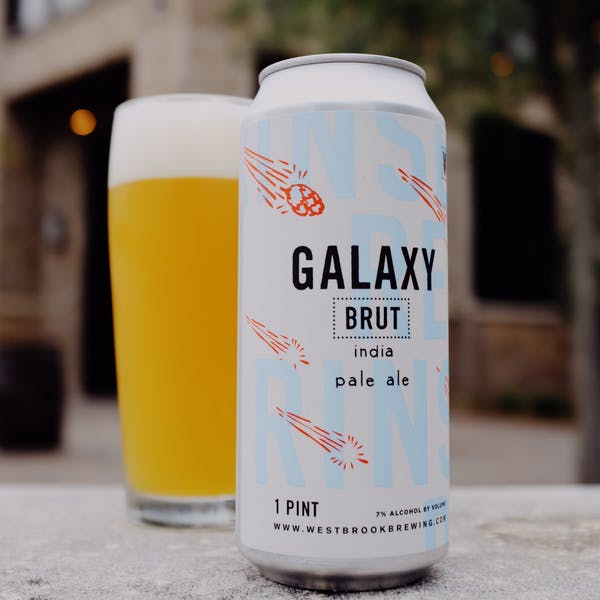
Our second pick is the Rinse/Repeat Galaxy Brut IPA from Westbrook Brewing. This minimalistic design plays off the Galaxy Hops the beer is brewed with by way of a doodled meteor shower overlay, while the subtle blue type in the background identifies it as part of their beloved Rinse/Repeat series. Together, these elements come together to create a can with an understated sophistication that will prompt customers to want to learn more.
Peggy Stewart Porter Can
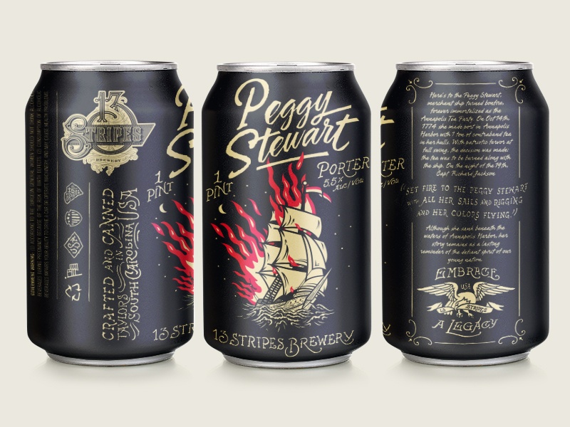
The Forefathers Group designed this label for a unique, old-world style brewery called 13 Stripes and their flagship porter, Peggy Stewart. Not only is the vintage-inspired illustration eye-catching by itself, but it plays off the lore of the historic Peggy Stewart ship, one of the most important ships in the Annapolis Tea Party event. This, paired with the custom typography, creates a can that is well designed and showcases exactly what makes this brewery and their beer so unique.
OFYMD
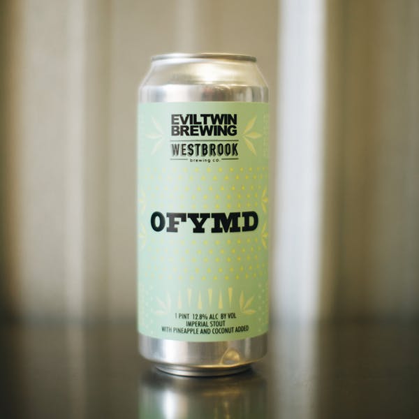
We’re featuring Westbrook Brewing a second time, as their OFYMD cans are too beautiful to pass up. The tropical colorway and small illustrations draw on the piña colada elements of this collaboration IPA, which clues customers into the fact that they’re getting something special from the moment they look at the can. With bold use of typography against a subtle pastel background, this design is minimalistic and straight to the point, so the identity of the beer can shine through unhindered.
If you can’t tell, we’re passionate about craft beer branding and label design! When customers aren’t in your taproom and able to get sample pours, establishing the unique identity of your beer is heavily dependent on the design of its label. If you’re a brewery interested in commissioning a label design, we’d love to see how we can help! Drop us a line today so we can chat all things beer.
Latest Posts