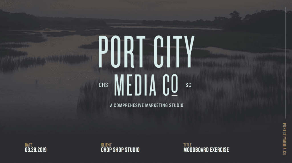
01. The Intro
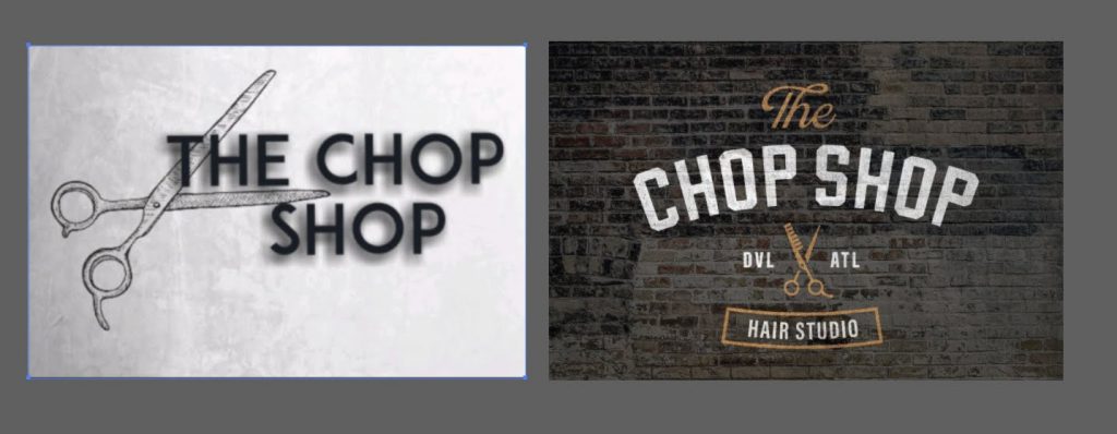
The Chop Shop is an industrial themed, high-end salon in Atlanta, Georgia. They had an initial logo (see below), but wanted to explore and take the brand even further.
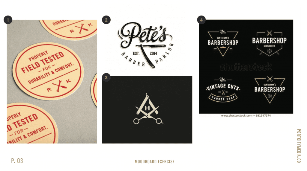
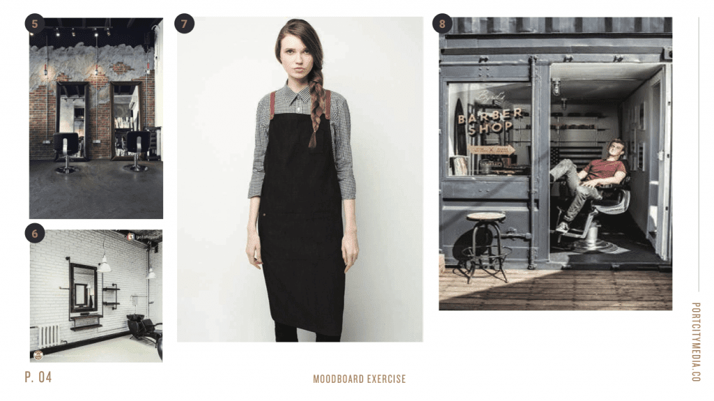
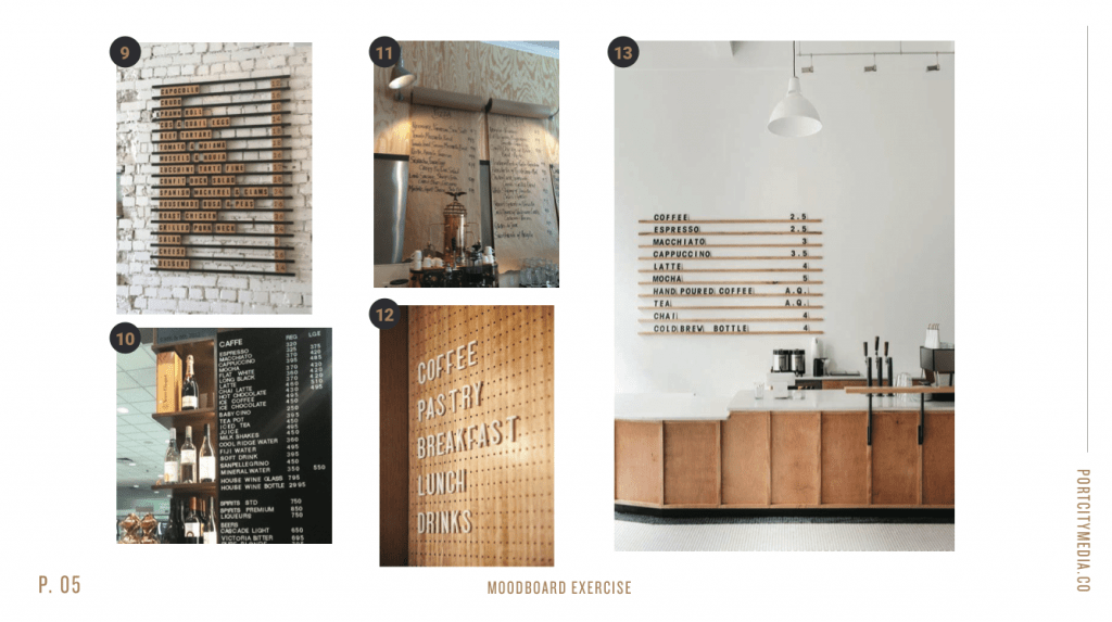
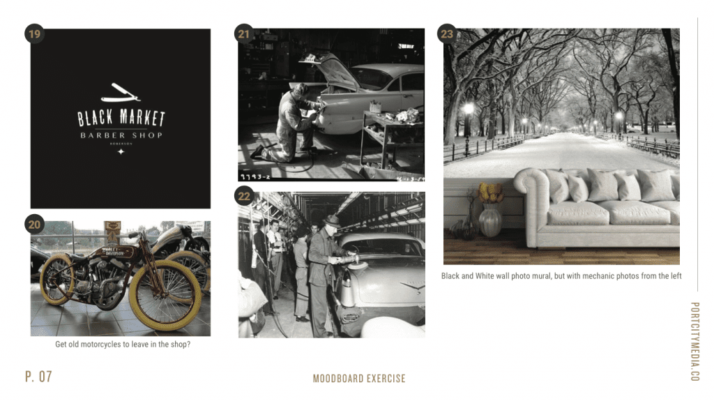
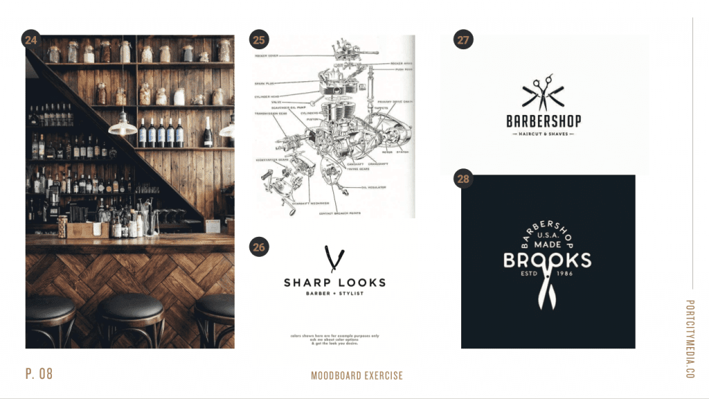
02. The Moodboard
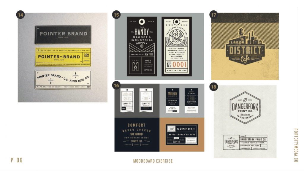
The moodboard session was incredibly fun since the modern industrial style is right in my wheelhouse. Using Adobe InDesign, I knew I wanted to focus on rough textures, block lettering, and a touch of hand drawn to give it that rough rustic feel.
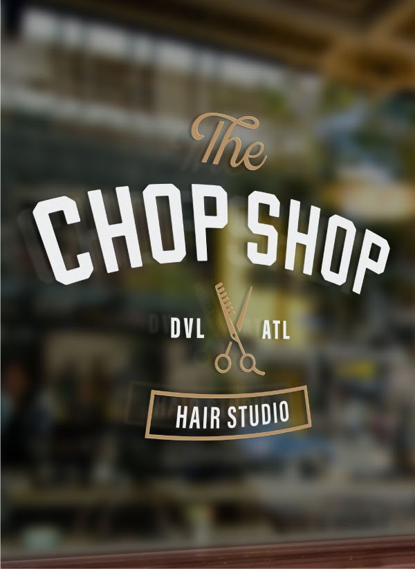
03. The Final Logo
The logo (created in Illustrator) includes a perfectly balanced script font called “Blackstone Script” and a chunky block sans called “Oatmeal Stout.” I love the way this all came together, especially in the mockups for the door decal! I’ll update this post with live photos once construction is completed!
04. Gear and Software Used
Latest Posts